Full-screen Header Images with Mockerie.io
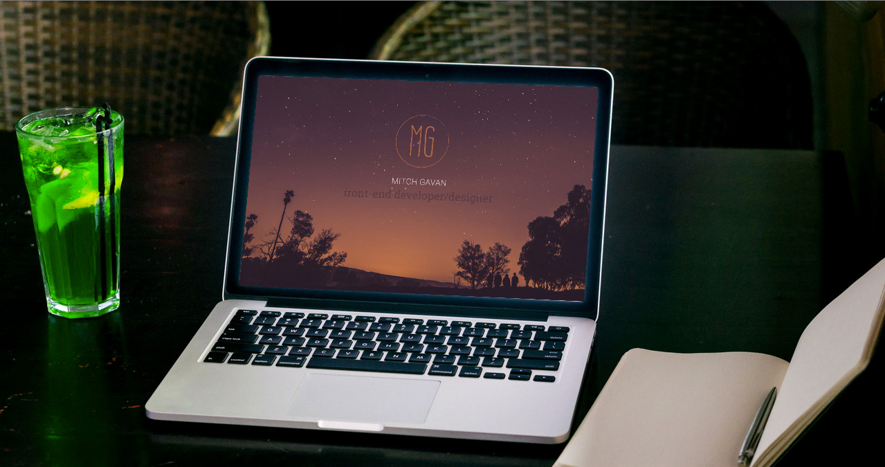
Large full-screen hero images have been a popular trend in web design for a while now. They are visually pleasing and draw the user’s attention. I’m going to show you a simple way to create a responsive full-screen header that will be sure to stand out. With the help of Mockerie.io, you can very quickly add a beautiful full-screen image that features your website mocked up perfectly on a laptop, tablet or phone. Also, the mockup is totally interactive!

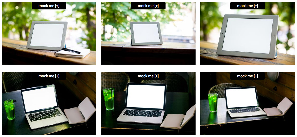
Mockerie.io is a brand new free service where you simply enter a website URL and you can see it mocked up on different devices within a wide range of environments. To begin, click the ‘try now’ button. After you’ve entered your email address, enter your website’s URL and then you’ll be able select the image you would like to see your website mocked up on.

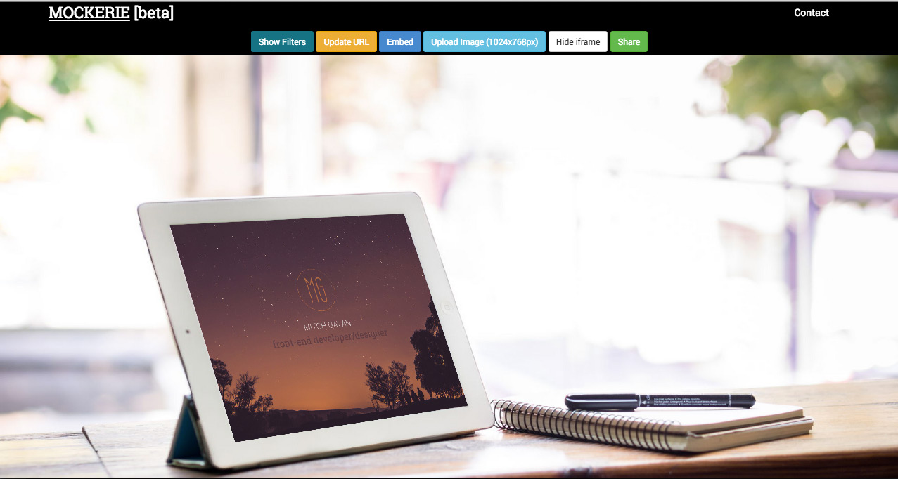
Next you’ll be taken to a high-res version of that image with your website mocked up on the device’s screen. And your website is completely interactive on the device. After you’ve taken a moment to enjoy that, click on the embed button to grab the embed code we will be using to create your full-screen hero image.

Let’s start creating our header. Firstly, here is the HTML:
  <div class="embed-frame">
    <iframe src="http://goo.gl/cT4grd" width="100%" height="100%" frameborder="0" scrolling="no"></iframe>
  </div>
That’s all of the HTML that is required. Mockerie.io simply provides us with an iframe, which has performed all of the tricky calculations to get your website positioned precisely on the device’s screen. It does this via CSS 3D transforms. Which is supported in all modern browsers, but not in IE9 and below. Check out this page for full compatibility details.
Now copy the URL from the embed code supplied by Mockerie, and replace the iframe’s URL from the demo code above with it.
Time to style this up. Here is the CSS:
html, body {
  margin: 0;
}
.embed-frame {
  width: 100vw;
  height: 56.25vw;
  max-width: 100%;
}
That’s all of the CSS needed. You will notice that we are using vw units to specify the width and height here. It stands for viewport width, and 1vw equates to 1/100th of the width of the viewport. This allows us to keep the aspect ratio of the iframe correct based on the viewport width. In the demo we are making the embed-frame the full width of the viewport, and the height value of 56.25vw has been calculated to keep a 16:9 ratio (9/16 = 0.5625). Go ahead and resize the browser window to see this in action.
Note: some mockerie.io images may have slightly different aspect ratios, you can adjust the CSS height value slightly to accommodate for this.
We now have a great looking responsive full-screen hero image with only a few lines of code. That’s all there is to it. I’ve also gone ahead and created a very simple page using the Foundation framework to provide some inspiration for incorporating this into your design.
Basic Demo
Example site demo

My name is Mitch Gavan; I’m a front-end developer/designer. I’ve got a blog over at mitchgavan.com where I write about some of the interesting projects, challenges and techniques encountered whilst creating for the web. I’m also on twitter, feel free to say hi!